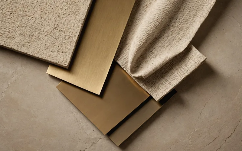
Keep the number of competing textures secondary to their structure. A textured room feels alive. An uncontrolled one feels noisy: surfaces compete for attention, materials argue instead of converse, and the space feels busy even with a calm color palette. The difference is not simply how many textures are present. It is whether they follow a coherent visual logic.
Texture layering rarely appears as an explicit part of design education. Designers usually build this knowledge through exposure and iteration, developing instincts for successful combinations without always being able to explain them. Defining that logic as working principles, rather than a fixed formula, makes it easier to assess your schemes and explain decisions to clients.
Scale as Texture's Key Principle
Texture works across several scales at once: the pattern or grain on a surface, the material element within the room, and the room itself. The key relationship is between texture scale and visual field. A coarse texture in a large format across a large surface reads as one cohesive element. The same texture in a small format on that surface reads as pattern. Those are different visual experiences, so the choice should be intentional.
Scale relationships decide whether several textures layer smoothly or compete. Textures with different scales but a shared character register, all fine-grained, all coarse-grained, or all between, usually work well together. Similar scales with different registers tend to compete. Two heavily veined materials at similar scales both demand attention and create visual argument. Pairing one heavily veined material with a quieter material at a similar scale lets the expressive surface read clearly.
Three Texture Layers
A practical residential framework divides texture into three layers: ground, mid-layer, and accent. The ground establishes the room's visual register, usually through the floor and, when textured, the primary wall treatment. Choose its texture for how it reads at full installation scale, not on a sample. Limestone with an open matrix looks very different across 400 square feet than on a 6-inch sample chip.
The mid-layer includes secondary surfaces such as upholstery, window treatments, area rugs, and secondary wall treatments. Because people encounter these materials more closely in normal use, their texture registers more directly. This is where contrast with the ground can enter: a smooth, even ground allows a textured mid-layer, while a patterned or active ground calls for quieter surfaces.
The accent layer covers the smallest areas but carries the most specific visual detail: decorative objects, cushion fabrics, trim, and hardware. Its limited area allows greater textural complexity. A heavily woven cushion fabric reads as an accent; on a sofa, it can dominate the room.
Natural and Manufactured Texture: What Each Communicates
Natural materials receive their texture from their source: wood grain follows tree growth rings, stone reflects mineral crystalline structure, and linen shows the dimensional irregularity of its fiber. This reads as authentic because it is. Each piece is unique, and its variation directly expresses a natural process.
Manufactured materials can reproduce natural texture with considerable fidelity, but their underlying logic differs. They are designed rather than grown, and their variation is controlled. High-quality manufactured materials can sit alongside natural ones very effectively. Lower-quality versions, with less convincing replication, can flatten a scheme by adding regularity where the surrounding materials show natural variation. This does not make manufactured texture inferior. It means the texture language should remain internally consistent. When a scheme uses genuine variation, its other materials should offer a comparable quality of variation, whether manufactured or natural.
Texture variety is not the same as texture noise
When layering creates noise instead of depth, the cause is usually one of three issues. First, too many materials at one scale are competing equally for attention. Identify the one or two materials meant to carry the most visual weight, then make the rest quieter. Second, the material character may not suit the application scale. A surface that works beautifully in a small area may read too actively when expanded across the visual field. Change the material or reduce the application area. Third, the character registers may conflict. Two materials can work well alone yet make the same visual argument in one room. Two dramatically veined stones, two heavily pattern-woven fabrics, or two large-scale linear wood grains require one to recede. Texture layering does not mean texture is a problem. At each register and scale, one material should lead the visual conversation while the others support it.